
Overview
The Westpac Scholars program awards 100 scholarships and fellowships each year, supporting students with funding, leadership training, and global opportunities. Its dedicated website serves as a hub for prospective applicants and a platform for current scholars and alumni to connect through the W100 Network—a lifelong community of over 900 changemakers built for lasting impact and growth.
TIMEFRAME
2 months
MY ROLE
UX/I Designer
TOOLS
Figma, Fig Jam
Problem Brief
How might we strengthen engagement and meaningful connections between current Westpac Scholars and alumni?
Design Process

Image from monday.com
Reframed Brief
The project had past UX research done to turn the Westpac Scholars in to a full-blown social media platform but was left abandoned and unfinished. Due to financial budget and time restraints, the project had to be done in-house with a limited amount of time (approximately 3-4 months).
It was handed over to me to finish the project The new identified problem was to get the scholars to find each other and get the engagement started through the website, rather than turn it into a social platform that keeps connections. By enabling the scholars to find each other in the W100 network and get relevant details to reach out to each other, it would satisfy the goal of this project, which was to increase engagement and connection between current scholars and alumni, thus creating a strong community.
Objective
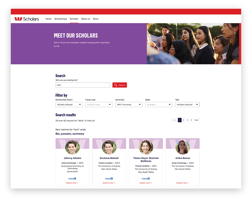
The objective of this project was to design a refined search tool for the Westpac Scholars website, enabling scholars and alumni to easily connect and build meaningful relationships.
The site was also refreshed with the new Westpac design UI, but the main focus was creating a search experience to drive lasting community connections.
Research
To research the UI and UX of both simple and advanced search tools, I researched retail companies, news publications, creative digital markets, and the main Westpac website itself.
Concept Ideation
After a thorough SWOT analysis of the different search tools, I designed five different concepts:
1. Visible advanced search filter
2. Action bar into a search bar
3. Tucked-in filter (when user knows who they're searching for)
4. Sticky filter
5. Seamless filter


Feedback & Iteration
Initial Choice: Concept #2
After presenting the four designs to the stakeholders, concept 3 was the winner. The simple and clean UI with the functionality where it remains stuck on the side as the user scrolls made it engaging throughout the entire search process, allowing users to change the filter as they wish without having to scroll all the way up.
Final Choice: Concept #5
As the design was further progressed, I realised that the drop down menu for each of the categories would become very long vertically, making it difficult for users to quickly see all the options.
Thus, the second iteration was to switch to concept idea 4.
Final Design

Reflection
KEY LEARNINGS
Always check & evaluate with design heuristics.
It is important to have the visibility of system status after every single click.
Practice macro and micro thinking.
An interface design may be nice on its own, but the whole brand needs to be considered (i.e. Westpac's new brand guideline). Considering this earlier on would have saved time from the entire process rather than prioritising seamless design.
"How does this align with the brand?"